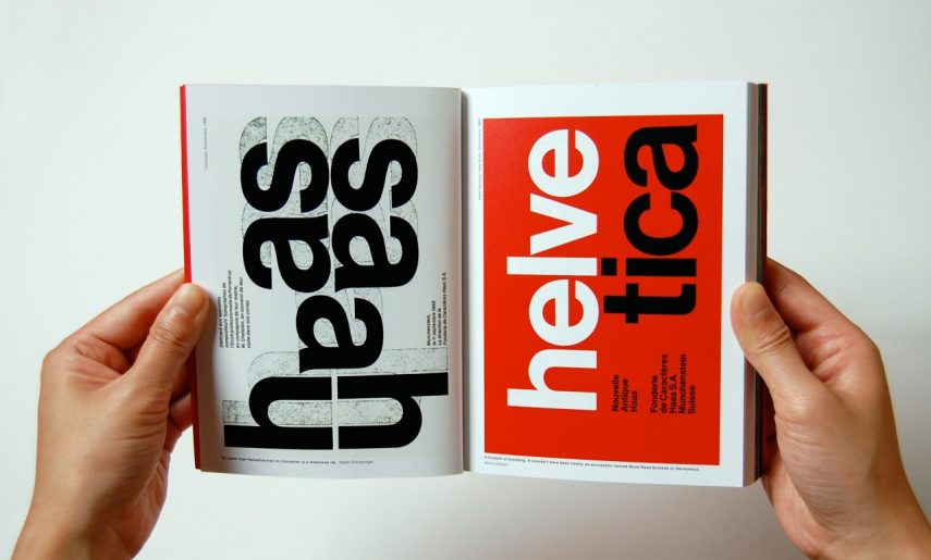
Helvetica Font History
Helvetica is one of the most popular typefaces in the world. More than a hundred years of history, dozens of logos of famous brands and more than a thousand characters from a variety of alphabets. All fonts in the logos of world famous brands are divided into two types – Helvetica and all the others.
This statement would not be comical if it were not true. McDonald’s, Nestle, Energizer, Muji, American Apparel, Toyota, Skype, BMW, GM, Google, Husqvarna, Intel, Jeep, Lufthansa, Motorola, Olympus, Panasonic, Placebo, Stimorol, Samsung, Sanyo, Texaco, Zanussi – all these logos created on the basis of Helvetica. Of course, the font is not used in pure form. Designers emphasize the internal rhythms of a word, adding characteristic elements, but in the graph of the logo itself is this common, familiar font. Helvetica is a really good font, very balanced. It has an almost perfect ratio of “white” (counter-forms inside the letter and the air around the letters) and “black”, thanks to which almost all the Latin words typed in this font seem to be complete and beautiful.
The font is very harmonious and at the same time neutral – it is this quality that determined its popularity. With this set of characteristics, Helvetica becomes the perfect font for the logo of a very large global corporation, whose mission is to please everyone.
The creation of this font began in the 50s, when one of the font companies in Switzerland decided to convert the existing Haas Grotesk font, which originated from the 19th century into something more modern. Designer Max Miedinger and Edward Hofman took on the task. The new font is called Neue Haas Grotesk. In 1961, D.Stempel AG (Germany) took up the popularization of this font. For marketing reasons, the font was named Helvetica (for the Latin name of Switzerland – Helvetia). This style has become very popular among supporters of the international style in the printing house, sometimes called the Swiss style. The main feature of this style was clarity, objectivity, and accuracy. Helvetica was the most popular typeface, so in 1983, Linotype released a new, improved version of the
Helvetica Neue font, consisting of an incredible number of options (51 stylesheets), including very bold and very thin characters. The Microsoft company, given the popularity of Helvetic, was forced to develop such a style, so Arial appeared in terms of saturation and width of characters, which coincides with Helvetica. Helvetica Neue was designed systemically, according to the Univers principle, and consists of a two-digit numeric notation to distinguish one type from another. With the introduction of computer desktop publishing systems, Helvetica has become a familiar name for every owner of a home computer, since this font, along with Times, has been embedded in most operating systems, text editors and typewriter programs, from the simplest to professional graphics packages.
Thus, the font that we now find in any Microsoft product has been designed to replace Helvetica. It is impossible to say that Helvetica is the most replicable typeface among Latin fonts, but undoubtedly, due to its popularity, it is among the most frequently copied and frequently used!
