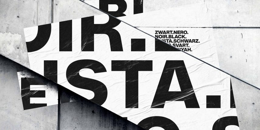
HELVETICA & HELVETICA NEUE FONTS
Helvetica is a sans-serif typeface that was designed in 1957 by Swiss typeface designer Max Miedinger with input from Eduard Hoffmann. The typeface was originally called Neue Haas Grotesk and was designed for the Haas Type Foundry in Switzerland.
Helvetica was created as a response to the increasing demand for a more modern, streamlined typeface in the mid-20th century. It was designed to be a simple, clean, and versatile typeface that could be used for a wide range of applications, from print to signage and beyond.
After its initial release, Neue Haas Grotesk was quickly licensed by Linotype and rebranded as Helvetica. The name “Helvetica” was chosen as a nod to Switzerland, the birthplace of the typeface and the home of the Haas Type Foundry.
Helvetica quickly gained popularity in the design world due to its clean, legible design and its versatility. It became particularly popular in the 1960s and 1970s, as the International Typographic Style, also known as Swiss Style, gained popularity. The International Typographic Style emphasized simplicity, clarity, and objectivity in design, and Helvetica was a perfect fit for this style.
Today, Helvetica is one of the most widely used typefaces in the world, and is recognized for its clean, modern design and its versatility across a wide range of applications.
Helvetica FONT-FAMILY OVERVIEW:
Helvetica
Helvetica Condensed
Helvetica Extended
Helvetica Narrow
Helvetica Rounded
Helvetica LT Std
Helvetica Neue FONT-FAMILY OVERVIEW:
Helvetica NEUE
Helvetica Neue Condensed
Helvetica NEUE Extended
Helvetica NEUE CYR
Helvetica NEUE LT Std
2019 Helvetica Now FONT OVERVIEW:
Helvetica Now
2019 Helvetica Now MICRO FONT-FAMILY OVERVIEW:
Helvetica Now MICRO (ALL PACK)
Why is it so popular?
The text, both small and large, is very pleasing to the eye, so it’s reading process is simple and easy. The font combines the perfect balance of white (counter-shape inside the letters) and black, because of this, each word looks complete and verified. At the same time, the message that comes through the text seems neutral and harmonious, as if Helvetica contains a kind of rod, defining its character, appealing to the majority.
Helvetica Font Benefits
- does not spoil the integrity of the composition / does not “touch” the idea;
- the most utilitarian and functional;
- contains a huge font family for every taste;
- is the most “proven” and recognizable font – “You do not know which font to choose – choose Helvetica!”;
- perfectly readable at any size;
- successfully “fits” in its original form;
- associated with many successful paintings;
- according to many designers who worked both in the 1960s and in the 2010s, is the perfect font;
- the only font to which the whole documentary is dedicated.
